From White Paper to a Billboard: The Evolution of a Mascot
This post will detail the evolution of Chuk, a mascot I created for a school assignment. He is a proposed mascot for Sport Chek, a Sports Equipment/Athletic Wear store.
Chuk is based on the "check", the Sport Chek logo. I turned the check on its side, with the wider part being on top. This gives him a distinctive look while tying into his parent company.
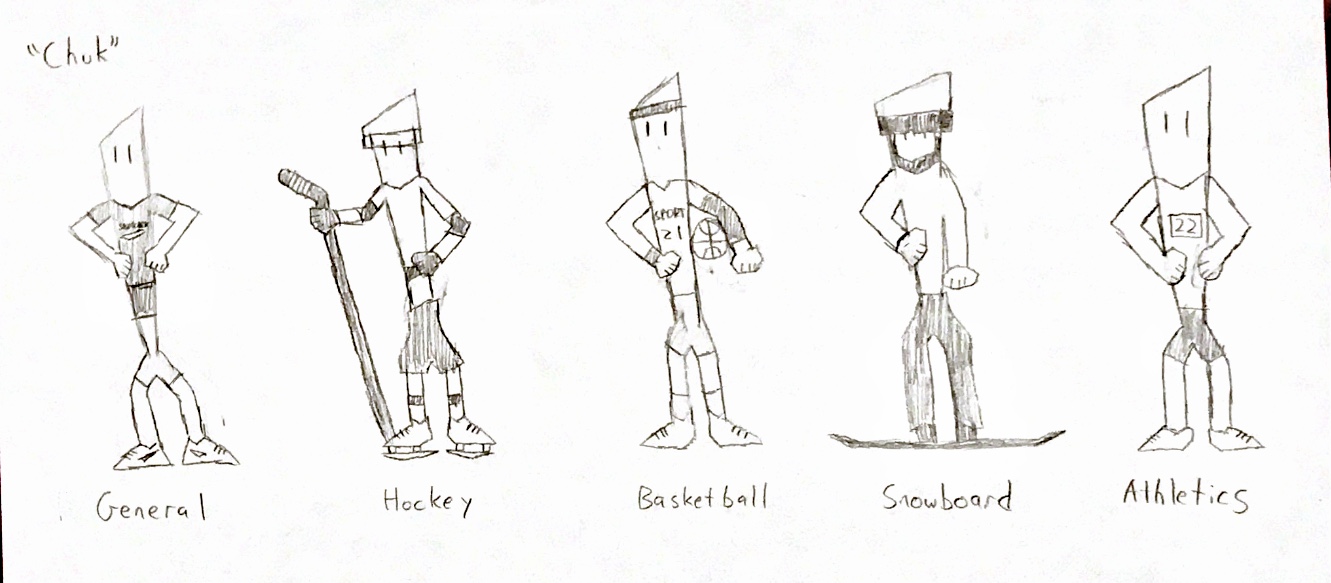
The first variation of Chuk that I made was basically the checkmark on its side, with two eyes slapped on. I made multiple versions of Chuk for this, each wearing equipment from a different sport. My idea was to have him wear this different equipment for different advertisements he'd be in.
There was a lot of improvement to be made, but I was still happy with the start.
After realizing that the different equipment was a little ambitious, I changed his look to a more general one, wearing an athletic shirt and shorts, as well as athletic shoes bearing the Sport Chek logo. I made 4 sketches of Chuk based on 4 Disney character archetypes, but I didn't feel like any of them were quite what I wanted him to look like.

After this, I made a digital version of what I Wanted Chuk to look like, and it came out better than I envisioned.

He still needed some tweaks, but I was still very happy with how his look was coming together. The only changes I would make from this point would be facial features and making him appear more athletic.
After getting some feedback that he should be more energetic and muscular, I made some tweaks.

I added a sparkle in his eyes to create more depth, and made his smile with an open mouth instead of closed, conveying more enthusiasm. I also made his upper body a little more muscular.
After getting feedback on that variation, I made some more changes, eventually creating the final version of Chuk.

I was suggested to give him "Pac-man shaped" eyes instead of the straight lines, and while I was hesitant at first, I tried them out and actually really like how they fit with the rest of Chuk. The other change is adding even more muscle to the upper body and shaping it so that he looks athletic instead of just being big.
This is the version I ended up using for my final project. From the first draft, he came a long way, and I'm happy that he turned out this well. Here's how he looks in action, on a proposed billboard advertisement.

Comments
Post a Comment